FORUM DARK MODE beta version

@Freak, Love some of the changes that you have already made since yesterday. Makes threads more readable. Only one suggestion outside of the one about the orange color on the notifications makes the users name unreadable… Can we maybe change the color for the likes to orange so that they pop a little more. Sometimes when I’m way behind, I like to scan threads and I will read posts that have a lot of likes. Harder to pick those up with the color of it now.
 
I love it, one suggestion for my old eyes, could you lighten the "title" font in the "Alert" drop down for a little more contrast
 
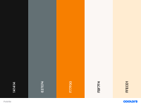
It is really cool that you did this. If you are still playing with the color palette, Coolors.co is very useful. Sometimes the generated schemes look great as big blocks of color but not so much once you starting putting small elements on top of large ones, i.e text on a background. The attached image uses some of your current colors and suggests a couple of others, it might be worth playing around with.

Link to the palette ( unlock the blocks if you want to experiment ) - Create a palette - Coolors
Palette.png
 
  • Like
Reactions: Rifleman
@Freak, Love some of the changes that you have already made since yesterday. Makes threads more readable. Only one suggestion outside of the one about the orange color on the notifications makes the users name unreadable… Can we maybe change the color for the likes to orange so that they pop a little more. Sometimes when I’m way behind, I like to scan threads and I will read posts that have a lot of likes. Harder to pick those up with the color of it now.
I'll mess around with it and take a look.

The issue I personally had on my phone with the original version of the dark mode I released, was that it was just too busy. All the orange abasing the dark background, white separator lines, action buttons. My goal was to try to make some of that noise disappear into the background so that reading the actual post, becomes a bit easer ... at least in my mind.
 
  • Like
Reactions: OGbabyaviVol
Explain how you use this?
Not a big deal, I just noticed it wasn't there. Sometimes when I'm searching for a certain post and have to go back several pages, it's easier when it's up top instead of having to scroll down.
 
@Freak Is it possible to have tweets show in a dark mode? The white is jarring.
I would think so, but when I go to other forums with dark themes, all of their tweets are white also, so I'm not sure. It's something I'll have to look into at some point. But I definitely agree with you.
 
  • Like
Reactions: mrmax86
It is really cool that you did this. If you are still playing with the color palette, Coolors.co is very useful. Sometimes the generated schemes look great as big blocks of color but not so much once you starting putting small elements on top of large ones, i.e text on a background. The attached image uses some of your current colors and suggests a couple of others, it might be worth playing around with.

Link to the palette ( unlock the blocks if you want to experiment ) - Create a palette - Coolors
View attachment 400724
Thanks, I need to look at something like this. For example, I moved f77f00 to ff8200 at some point, but I still have remnants. Right now, I have way too many similar colors going on and I'l like to go with the three basic UT colors and just a couple complimentary ones.

Some of this stuff really turns into a headache. lol. I'm remembering now why this has been in testing for so long and I still hadn't released it. Doing a full custom takes a lot of tweaking.

Anyway, thanks for the feedback.
 
Not a big deal, I just noticed it wasn't there. Sometimes when I'm searching for a certain post and have to go back several pages, it's easier when it's up top instead of having to scroll down.
I see.
 
Thanks, I need to look at something like this. For example, I moved f77f00 to ff8200 at some point, but I still have remnants. Right now, I have way too many similar colors going on and I'l like to go with the three basic UT colors and just a couple complimentary ones.

Some of this stuff really turns into a headache. lol. I'm remembering now why this has been in testing for so long and I still hadn't released it. Doing a full custom takes a lot of tweaking.

Anyway, thanks for the feedback.

You are welcome. Color is an odd thing. Generators can help dial it in, but color is oddly enough about more than simply "color". The generators are a good start but size of the elements and the proximity to other colors can really skew the results.

The palette I linked has a couple of your colors and also some suggested compliments. Oddly enough I picked the orange in the palette from a screenshot of VN and got the F77F00 version.

You can lock the colors you know you want, and then just hit the spacebar to generate new complimentary choices until you see something you want to work with.

I would go with ONE dark, one medium, your orange, and a white / grey period. Like right now the sidebar area is straight up black, the page background is I think #141414, and the comment area BG is something else. I would lose the true black sidebar for a start.

Good luck, color is interesting and infuriating all at once!
 
  • Like
Reactions: Freak

VN Store


Back
Top