- Joined
- Oct 22, 2003
- Messages
- 97,960
- Likes
- 121,594
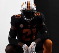
So I've been working on this for a while, messing around with shades of dark and such. It's not quite finished yet. I'm still not happy with some parts of it and I haven't changed over all of the buttons yet (I planned to work on that some this morning but woke up to an HVAC issue that's taken up my day, but that's another story). That said, with the Dark Mode uniforms, I pretty much had to go ahead and release it in it's current state.
Anyway, I'll leave this thread either here or on the help forum so you guys can provide feedback and/or suggestions. There are some things besides the buttons that might still be broken. You can post screenshots of those things in this thread to bring them to my attention. Your assistance is appreciated.
As always, you can change the forum skin in the bottom left of the forum. Click the link that says VolNation 2018 and then select Dark Mode 21.
Here's a direct link to turn it on.
Dark Theme 21
To turn it off.
Light Theme
Go Vols!


