Is this a new UNI?

#51
#51
We actually did have jerseys like this for 1 game in 1987 against Cal.

FCR64IEQCZO3JASQ3CNO7Y56CI.jpg

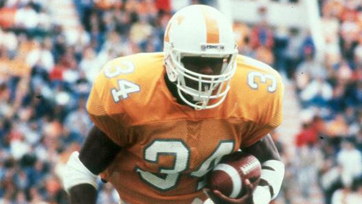
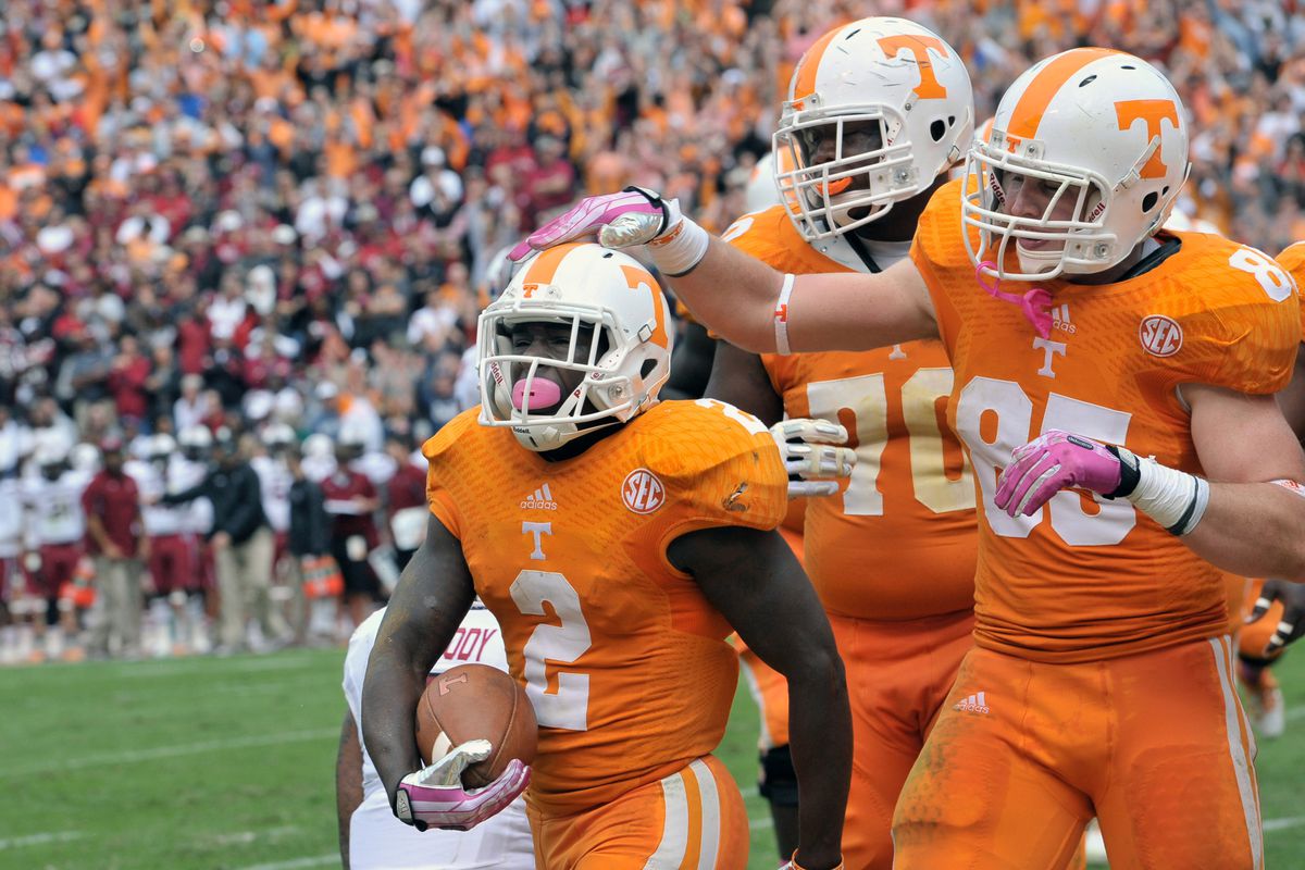
I was there for that one. I was in the upper deck. It was the easiest time I ever had recognizing what number each player was wearing from there. Now I know the majority love the orange with white home jersey, but if this were to become a permanent thing, I could deal with it.
 
#52
#52
Looks like a bad editing job. Look where the T is on the helmet
The T overlaps the strap on the chin strap too. But the face mask looks legit. Look how the orange is under the clear clip. The jersey looks legit too.
But you are right, the T looks really off!
 
#54
#54
I love the dark uni’s . And (see above post ) if the kids want it .. give it to them . We “ get off my lawn types “ will survive . Lol

Exactly. If the kids love it that's all that matters. The fans aren't the ones busting it on the field.
 
#56
#56
Love this..would look good with the Black Unis..maybe just outline everything in black to better match the Dark Modes..I actually really love this for a game or 2 a year. Or better yet do the helmet in black, with white lettering and orange around the letters..

With white jerseys and orange britches for a couple road games
 
#61
#61
9138664.jpeg
20131019_kkt_ab2_151.0.jpg

Nothing wrong with these in the least. Can argue about the texture look in the numbers of the white jersey, but from the majority of the views, that can't be seen.

I can definitely complain about the tire tread on the shoulders, the original Smokey Greys and the fact that there should never be a script ‘Tennessee’ on a jersey.
C7FD04FE-2DF2-4596-8D69-A282BB6F990A.jpeg
 
#64
#64
Maybe, Adidas was a helluva lot better than the too-busy Nike ones (the helmet was good), and why?
I’ll disagree. I think Nike Greys were better . I’m not a huge fan of the black uniforms bc I think the black uniform thing is really played out and I would really like to see our road whites w/o the orange collar. White collar, orange power T would be sharp.
 
  • Like
Reactions: vol_smoothie
#65
#65
Woah !! Bring back BLACK linings on numbers and names, make the collar the same color as the jersey like Bama does.
The opposite color collar looks like a middle school team. Keep the white face masks.
And, for the love of God, keep the twin striping on the pants - very sharp and traditional.
Those big single stripes like 2003 and idiot Butch with his gimmicky checkerboard on the pants and back of helmets was awful.
 
#66
#66
I liked the traditional Adidas jerseys worn by Coach Fulmer's teams except for the tiny name plates on the back that were used in the late 2000's.
They looked like Stoner Joe's t-shirts on Cumberland was doing our lettering.

Also could have done without the gigantic numbers of the mid-90's.
However, they were better than our current Nike numbers that look like they were created by some effeminate clothing designer from Paris.
 
Last edited:
#69
#69
The jersey looks to much like Clemson imo


Nah, Clemson wears purple. Personally, I like it. Maybe it is my eye sight with age, but the trim would make reading the numbers just a bit easier for me if I were to actually show up for a game and sit in the stands. But since I will probably only watch from home? I find myself worrying less and less about it.
 
  • Like
Reactions: dduncan4163
#70
#70
Bama, Ohio State, Clemson, Georgia, Oklahoma…….none of these teams jack around with their unis very much and last time I checked, they’re pretty good.

and then there's Penn State's unis...like em or not, they don't change as far as I can recall
 

VN Store


Back
Top