WillFollowPearl
Well-Known Member
- Joined
- Nov 8, 2007
- Messages
- 260
- Likes
- 24
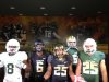
I know that uniform manufactures usually work on a 2 year cycle. With that in mind I can't help but think that the uniforms Tennessee will be getting next year have already been designed/approved, and possibly even manufactured at this point, and just waiting to be unveiled in July.
I'm not asking for a detailed description of the uniforms for any sport if you have seen them, but rather if there is a significant difference in style/look of the unis apart from cut and fit that we already know will be different.
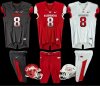
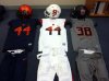
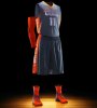
I would assume that the football unis wont be much different, if there even is a change, but w/ basketball I'm expecting some sort of aero-graphic design on the back of the shirt like most Nike schools have with some other standard piping on the sides. Honestly baseball is what I'm most curious to see. Also will they be bringing any new logos to the fold much like adidas did with the new smokey logo and Vols wordmark.
Any info would be appreciated. SIAP
I'm not asking for a detailed description of the uniforms for any sport if you have seen them, but rather if there is a significant difference in style/look of the unis apart from cut and fit that we already know will be different.
I would assume that the football unis wont be much different, if there even is a change, but w/ basketball I'm expecting some sort of aero-graphic design on the back of the shirt like most Nike schools have with some other standard piping on the sides. Honestly baseball is what I'm most curious to see. Also will they be bringing any new logos to the fold much like adidas did with the new smokey logo and Vols wordmark.
Any info would be appreciated. SIAP
Last edited: