BigBadVol
The MojoMofo
- Joined
- Feb 2, 2010
- Messages
- 5,186
- Likes
- 11,432
I'm rustled, brother. I'm all for sticking with that classic Power T. This logo and the interlocking are fine for secondary use, but we are widely recognized for the Power T.I would love to see a large rifleman logo on the side of the gray helmet. Im sure I just rustled some jimmies by saying that, but man would it look awesome.
Sorry man. I knew it would be an unpopular take. I also know how important the Power T is to everyone. It’s one of the most recognizable logos in sports.I'm rustled, brother. I'm all for sticking with that classic Power T. This logo and the interlocking are fine for secondary use, but we are widely recognized for the Power T.
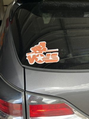
I’ve seen some mockups with it on there before. I will look again when I get back to my desk and see if I can find the images.Always liked the rifleman logo.
Gotta admit though, the design could possibly use a bit of updating. Never really noticed before how dated it looks now-straight outta 1974
Also not sure how it would look on a helmet. There is quite a bit of detail in there (tassels, etc) which would be lost in shrinking the design down.
Yes, any logos need to be simple, not busy. They need to be suggestive rather than striving for detailed precision.Always liked the rifleman logo.
Gotta admit though, the design could possibly use a bit of updating. Never really noticed before how dated it looks now-straight outta 1974
Also not sure how it would look on a helmet. There is quite a bit of detail in there (tassels, etc) which would be lost in shrinking the design down.