
You are using an out of date browser. It may not display this or other websites correctly.
You should upgrade or use an alternative browser.
You should upgrade or use an alternative browser.
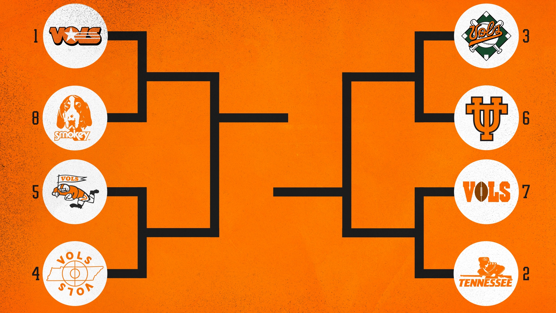
Vol retro logo madness
- Thread starter Freak
- Start date
jackieaprilesr
leave the gun, take the cannoli
- Joined
- Aug 13, 2018
- Messages
- 247
- Likes
- 313
jackieaprilesr
leave the gun, take the cannoli
- Joined
- Aug 13, 2018
- Messages
- 247
- Likes
- 313

bpalmer28
Well-Known Member
- Joined
- Jun 24, 2010
- Messages
- 12,544
- Likes
- 20,794
HollowaytoSeivers
BVS is REAL
- Joined
- Dec 15, 2009
- Messages
- 4,016
- Likes
- 5,540
1 in 102 455
Long-Time Lurker
- Joined
- Jan 31, 2013
- Messages
- 575
- Likes
- 706

Xtra Orange
Well-Known Member
- Joined
- Feb 8, 2010
- Messages
- 105
- Likes
- 71
Xtra Orange
Well-Known Member
- Joined
- Feb 8, 2010
- Messages
- 105
- Likes
- 71
Xtra Orange
Well-Known Member
- Joined
- Feb 8, 2010
- Messages
- 105
- Likes
- 71

TNnative
Well known pain in the azz
- Joined
- Oct 21, 2012
- Messages
- 13,924
- Likes
- 10,701
We're unique. I like that too. I can't think of anything worse than having a team nicknamed Tigers.
Well, Hell. When someone mentions the Tigers? How many colleges have a tiger mascot? Something I give my Auburn alumni sister in law Hell about. Why they don't just run with War Eagles escapes me. Be unique; like the Vols, Razorbacks, Seminoles, ect ect..What about Commodores? Well, let's not get carried away with it.
RDU VOL#14
I’m a Flawed Character
- Joined
- Sep 11, 2007
- Messages
- 27,071
- Likes
- 40,683
SprocketRocket
Well-Known Member
- Joined
- Aug 13, 2014
- Messages
- 562
- Likes
- 1,480
I have to admit, I'm a bit surprised by the love for #2. Obviously it's considered largely popular to earn that #2 seed. Just not my thing, I guess.
It's funny - when #2 was originally used I really didn't like it much, and I always despised #5 for being too cartoonish. As I've gotten older, I've grown to love both of those with #2 being one of my all-time favorites. Odd how that happens. Keep hanging in there - there's hope for you too!
chuckb1448
Well-Known Member
- Joined
- Sep 15, 2007
- Messages
- 10,496
- Likes
- 7,510
BlackCreekVol
Maybe Next Year
- Joined
- Jan 25, 2016
- Messages
- 1,408
- Likes
- 2,711
Jacksonvol
Well-Known Member
- Joined
- Aug 26, 2006
- Messages
- 448
- Likes
- 387
AA As a youngster in the 50's, I thought that this was as important as the Mona Lisa..Still do..Wish we saw it more..I hate to say it ... But yes there is!
It's hard to be humble ...
But this is my all time fav ...
View attachment 267275
Larkin
Freak's mentor
- Joined
- Oct 23, 2003
- Messages
- 4,721
- Likes
- 4,149
VolForLife83
Well-Known Member
- Joined
- Jul 7, 2010
- Messages
- 10,432
- Likes
- 11,893
Advertisement
