Uniform/Helmet/Shoe design thread (merged)

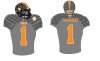
I've been against Nike from the jump. However, I'm a reasonable person. I wanna see someone take this picture (WVU is a Nike school), and change the colors to......something more appropriate for Tennessee. Convince me. Plus, it gives you something to do.

Just because WVU is a Nike school means we're going to get exactly what they or any other school gets, just with our colors.

That uniform is horrible because of the design. I hate the side stripes on the jersey, a design theme that is about 10 years out of date.
 
  • Like
Reactions: 1 person
Welcome to losersville. They are cursed.

Saying any uniform is cursed is stupid. The all orange was supposed to be cursed, yet we did fine against SC last year in them.

We lost a lot in orange/white and all white the last few years, maybe we should dump those too.
 
  • Like
Reactions: 1 person
197836.jpg


Best combo ever. Solid white pants. Thick numbers, thick unique font for the names.

I also miss the yellowish orange we used to wear on the football field. I know it's not the "official" orange, but so many of my favorite memories are in that color...

I agree. I'd also like to see a bigger/bolder font on the current unifrms.
 
I like the striping idea on the helemt you've shown but I'm not a bigfan of Smokey's head as the emblem.

I'd like to see a white power T outlined in orange or orange in white outline.
I could also settle for that 'VOLS" logo

I look forward to getting those retarded tread marks off our sleeves though, I'll tell you what.
 
Last edited:
i would like to see the carbon fiber grey like Oregon has and a chrome orange power t with the chrome orange stripe on the top like Denver has \\:cool:
 

VN Store


Back
Top