Promotion/experiment with top ads on mobile.

#26
#26
It's annoying. Lol
I'm open to suggestions. We can have it at the top or bottom. Problem is the other ads just aren't paying anything. It's why you're even seeing subscription sites like on3 using these in addition to the monthly fee. I haven't made any final decisions though and welcome any more suggestions. Thanks.
 
#27
#27
Yes, others in the zone are reporting the same.
The same issue with avatars that aren't visible? Can you ask them to post their phone/browser here along with a screenshot.

Thanks for the feedback.
 
#28
#28
I'm open to suggestions. We can have it at the top or bottom. Problem is the other ads just aren't paying anything. It's why you're even seeing subscription sites like on3 using these in addition to the monthly fee. I haven't made any final decisions though and welcome any more suggestions. Thanks.

I don't know anything about that stuff so I have no useful suggestions. It's annoying, but I'll suck it up if I have to. I'm just relieved it's you and not on my end.
 
#29
#29
I don't know anything about that stuff so I have no useful suggestions. It's annoying, but I'll suck it up if I have to. I'm just relieved it's you and not on my end.
It shouldn't be blocking any content and it should look the same as what texags does.

Texas A&M Football Forum | TexAgs

Again, I haven't made any final decisions on whether we will keep it but our mobile ad revenue is very poor and mobile gets about 65+% of our traffic so I'm trying to find a solution that's not intrusive like popups or video players, but I don't want the user experience to be poor so feedback helps.
 
#30
#30
It shouldn't be blocking any content and it should look the same as what texags does.

Texas A&M Football Forum | TexAgs

Again, I haven't made any final decisions on whether we will keep it but our mobile ad revenue is very poor and mobile gets about 65+% of our traffic so I'm trying to find a solution that's not intrusive like popups or video players, but I don't want the user experience to be poor so feedback helps.
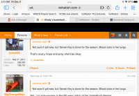
Well, the first screen shot is how it normally is (without the black bar) and the second is how it is now.

Screenshot_20221208-205119_Chrome.jpgScreenshot_20221208-205106_Chrome.jpg
 
#34
#34
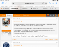
Here’s how it looks on a 6th gen ipad running 15.6.1. On the wider iPad screens, the avis are on the left, rather than on top. So the timestamp is cut off.

it looks like the lower edge of the black ad bar is set to end where the text begins (“volwindy said” in this case,) I don’t know if you can change it to end above the time stamp/ where the border of the new post begins?
1670581441901.png
 
#35
#35
Here’s how it looks on a 6th gen ipad running 15.6.1. On the wider iPad screens, the avis are on the left, rather than on top. So the timestamp is cut off.

it looks like the lower edge of the black ad bar is set to end where the text begins (“volwindy said” in this case,) I don’t know if you can change it to end above the time stamp/ where the border of the new post begins?
View attachment 522110
I see the issue. I’ll work on it today and try to get that fixed. Thanks.
 
#36
#36
Here’s how it looks on a 6th gen ipad running 15.6.1. On the wider iPad screens, the avis are on the left, rather than on top. So the timestamp is cut off.

it looks like the lower edge of the black ad bar is set to end where the text begins (“volwindy said” in this case,) I don’t know if you can change it to end above the time stamp/ where the border of the new post begins?
View attachment 522110

It cuts off Joe’s head. Mission accomplished.
 
  • Like
Reactions: Notorious B.E.N

VN Store


Back
Top