VolAllen
Well-Known Member
- Joined
- Mar 14, 2014
- Messages
- 7,067
- Likes
- 8,007
For what it's worth, I support exactly no comments you're making in this thread. I think you're just sour grapesing all over the place.
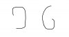
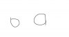
I just want to know how a 6 and a 9 would look without the top and/or bottom. But if it did, I can see why he'd say that it was an atrocious font.
It's not the connecting line. The 6 would look like a b. The 9 would look like a backwards P.