NEVolFan
Ima dude playing a dude..
- Joined
- Oct 8, 2006
- Messages
- 20,676
- Likes
- 23,974
They actually got it right somewhere around 2012... after being Tennessee's supplier for more than a decade.
Nike gets it right 2 weeks before they even become our supplier.
EDIT:
1999:

2009:

2012:

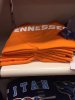
The first "N" is only slanted bc it is after the letter "E". The state of tn runs east-west obviously, and so the font allows all open ended letters running east/west to slant like the outline of the state. I think it represents us well and like it a lot. So do a whole bunch of other people I know. So yes, you're in the minority. GO VOLS!!!Man, I just don't like the design of that first N. I don't care for the S's either. They look closer to 5's than S's to me. I hope this doesn't become a trend for Nike UT clothing, hats, etc. Am I in the minority with not liking this particular shirt?
The first "N" is only slanted bc it is after the letter "E". The state of tn runs east-west obviously, and so the font allows all open ended letters running east/west to slant like the outline of the state. I think it represents us well and like it a lot. So do a whole bunch of other people I know. So yes, you're in the minority. GO VOLS!!!
The first "N" is only slanted bc it is after the letter "E". The state of tn runs east-west obviously, and so the font allows all open ended letters running east/west to slant like the outline of the state. I think it represents us well and like it a lot. So do a whole bunch of other people I know. So yes, you're in the minority. GO VOLS!!!

They found a local supplier that could throw the black jerseys together last minute (hence the poor quality), but the normal stuff came from Adidas.Isn't the actual game worn gear made by done company near Knoxville and they just slap logos on them. Seems like I remember hearing the black jerseys in 09 were last minute decision made possible because the actual supplier just down the road.
If the whole word "TENNESSEE" in that font represents the state of Tennessee, does that awkward "N" also represent Nashville? I mean it is kind of in the middle of the state.
How do you know he's in the minority? Simply because he doesn't agree with you? I happen to know a whole bunch of people that hate it. I'd say it's split down the middle at this point.
I give the conceptual "idea" a thumbs up but in print it just doesn't aesthetically look right. Not that my $ will matter in the grand scheme of things but I won't be buying anything with the new wordmark and will stick to things that just have the Power T.
I like the font but is it just me or is all the stuff just have a basic generic look we've seen for years from Adidas? I was hoping for something flashy but I guess the traditionalist's way of thinking won out...
That's just one shirt, just wait. We'll have the same Nike stuff all the other fan bases have.