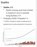
GA actually has actually intentionally changed it's data presentation to the public to hide reality. The data you present there is, in fact, presented in a bogus way. Wish I were making this up, but as the result of numerous people complaining about recent errors in CV19 data presentation, the Governor's office actually issued a formal apology:
"DPH changed the graph Monday after more than a day of online mockery, public concern and a letter from a state representative. Gov. Brian Kemp’s office issued an apology and its spokespeople said they’d never make this kind of mistake again.
“Our mission failed. We apologize. It is fixed,” tweeted Candice Broce, a spokeswoman for the governor."
Also from the article:
"Others worry the data is being portrayed in a way that favors Kemp’s early easing of restrictions. A separate graph on DPH’s page has led readers to think that cases were dropping dramatically, even though lower case numbers were the result of a lag in data collection.
“I have a hard time understanding how this happens without it being deliberate,” said State Rep. Jasmine Clark, D-Lilburn, who received her doctorate in microbiology and molecular genetics at Emory University. “Literally nowhere ever in any type of statistics would that be acceptable.”
‘It’s just cuckoo’: state’s latest data mishap causes critics to cry foul


