Uniform/Helmet/Shoe design thread (merged)

My opinion? I thought the Nike stuff would be much better. I was wrong. Just the money was better.

I thought UT made less $$$$ from Nike than Adidas. Maybe it was less up front but potentially more over time depending on sales...
 
I thought UT made less $$$$ from Nike than Adidas. Maybe it was less up front but potentially more over time depending on sales...

Don't know. All I remember was there was suppose to be some sort of a big money incentive from Nike to switch to them that Adidas wouldn't match or better. But my main point was the look of the uniforms. That new "Tennessee" logo Nike rolled out in year 1 is getting old real fast. And the uniforms just aren't the huge improvement everybody was pumped up for. And its not just one sport. Maybe the swim, soccer or golf teams look better, but I never watch that.

I went to look at some of the fan gear a few weeks ago at Hound Dogs. I didn't see even a tee shirt worth buying. Pretty sad state that the stuff at Wal-Mart looks maybe a little better than the official Nike gear.

Orange and White is a tough color scheme to work with, but it's ours. Only thing they have done that looked good was that mountains motif on the gray helmet, but the uniforms just looked filthy. I don't know who from Nike and who from the university draws up uniform designs and approved them, but there isn't a tablespoon of taste between all of them.
 
  • Like
Reactions: dduncan4163
I agree. The Nike unis have been somewhat disappointing. I thought our Adidas unis those last couple of years were clean (except the tire treads)!

One thing Adidas did right was the white border around the orange numbers on the gray jersey. Made them pop and easier for my old eyes to read. Nike's two shades of gray just looked ugly. And those checkerboard stripes? Yuck! There are some NFL 1940s throwbacks that look better.
 
One thing Adidas did right was the white border around the orange numbers on the gray jersey. Made them pop and easier for my old eyes to read. Nike's two shades of gray just looked ugly. And those checkerboard stripes? Yuck! There are some NFL 1940s throwbacks that look better.

I like the shade of grey on the Nike unis better, as I thought it was too light on the Adidas one. But you're right, the white border around the numbers looked better. Not to mention the number font looked better on the Adidas jerseys
 
  • Like
Reactions: Steven5198
I like the shade of grey on the Nike unis better, as I thought it was too light on the Adidas one. But you're right, the white border around the numbers looked better. Not to mention the number font looked better on the Adidas jerseys

Actually the Adidas grey was darker than the Nike one. The shoulders were darker, but the main body was lighter.
 
Never felt Adidas got our orange right and ultimately that’s all I give a crap about fashion wise.
 
  • Like
Reactions: Yeiser10
Never felt Adidas got our orange right and ultimately that’s all I give a crap about fashion wise.
Actually, the orange has been pretty fluid the last 50 years. Dickey, Battle, and Fulmer used a lighter shade and Majors and the more recent coaches had a more solid shade of orange. It appears that Nike is somewhat in the middle of both.

Personally, I do not care for anything Nike has put out. When I do purchase I prefer Columbia, Adidas, or other brand. Just seems like better quality at a better price, especially Columbia.
Liked the quality of orange since Nike took over...opinion unchanged.
 
  • Like
Reactions: Yeiser10
Nice. When you find Spot Bilts you'll probably also find this stuff:

980d4c0c-dfe1-418c-b3f0-ed6a2627be71_1.59202209461bcd6a000a2955d2ce52f1.jpeg
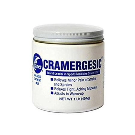
Wow. What a flood of memories that picture brought back. We also had a tub of “Atomic Balm” by the same company. It was so hot I always thought the coaches were punishing you for being a sissy about your injury if they put it on you. Unbearable pain. I had to ice my thigh for hours one night because they put too much on me and it was so hot. I was in tears. Stuff wouldn’t wash off either.
 
I do remember the Atomic Balm. Wrap that stuff up too tight and it would take the top layer of skin off. Good Lord that was some hot stuff. It burnt so much it made you forget about the sore muscles. lol
 
Don't know. All I remember was there was suppose to be some sort of a big money incentive from Nike to switch to them that Adidas wouldn't match or better. But my main point was the look of the uniforms. That new "Tennessee" logo Nike rolled out in year 1 is getting old real fast. And the uniforms just aren't the huge improvement everybody was pumped up for. And its not just one sport. Maybe the swim, soccer or golf teams look better, but I never watch that.

I went to look at some of the fan gear a few weeks ago at Hound Dogs. I didn't see even a tee shirt worth buying. Pretty sad state that the stuff at Wal-Mart looks maybe a little better than the official Nike gear.

Orange and White is a tough color scheme to work with, but it's ours. Only thing they have done that looked good was that mountains motif on the gray helmet, but the uniforms just looked filthy. I don't know who from Nike and who from the university draws up uniform designs and approved them, but there isn't a tablespoon of taste between all of them.

Seems to me that since Pruitt took over the emphasis on the "uniform" look of all the uniforms has been de-emphasized. Pruitt did away with the Smokey Greys and went back to the simple white pants. Then the men's basketball team chose to make their throwbacks their fulltime home uniform.

I have to admit I don't miss the Smokey Grey's very much, not on the football team or the basketball teams. The baseball and softball teams still use them and I can see them keeping them because they play more games and could use the variety but honestly they are my least favorite looks each wears. And I kind of felt the baseball team wore them too much.
 
  • Like
Reactions: onevol74
My uniform thoughts:
Keep away the gray
Wear orange pants once a year on the road and once a year at home.
Develop an Orange Helmet with a White T to wear once a year on road and once at home.

This, minus the helmets. Orange britches for one home and one away every year.
 
  • Like
Reactions: dduncan4163
This will not be well received but,

I want the orange pants for both home and away for big games Florida, UGA, Bama, maybe Auburn and SEC Titles.

Then playoff games.

I'm an orange pants advocate but even I only want them for all orange one home game and orange pants for one road game. I would like it to be more an almost special occasion to wear them. I think that's the best compromise. The purists get the classic home look for all but 1 home game and the stormtrooper purists get that uniform for all but 1 road game and the orange pants advocates are given 2 games.

As far as SEC Championship/bowl/playoff games, I think for SECC, playoff, and any non-playoff New Year's Six we should wear the classic looks. Maybe even for the Citrus, Outback, or Gator too as those are kind of the next 3 bowls in line after the NYS. But any bowl lower than that, I'm fine with all orange or white/orange pants.
As far as the CFP is concerned, I just want to see the CFP Logo on our jersey and the Platinum Swoosh on the jersey .
 
I'd like the seniors to wear a uniform of their choice for one home game of the year. If its orange helmets with smokey grey pants, I'm fine with it. Any combination the seniors want for one game per season would be fine with me.
 
  • Like
Reactions: tennvols77

VN Store


Back
Top