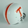
New power T

#26
#26
Can anyone confirm that the T has been modified some? I thought that I read something that said that it has been and from looking at pics it's kind of looks like the bottom part of it is a little slimmer. But maybe I'm just seeing things. And one of my buddies calls me crazy and says it hasn't changed at all. Deer park can you confirm this? Or anyone else thanks

Brand New: New Logo, Identity, and Uniforms for University of Tennessee Athletics by Nike

This was also linked earlier in another discussion.

To me, I understand standardizing something, but to me, it looks bad on the helmets and it is another example of Nike pushing their will on another school.

The Power T looked better when it was wider than it was taller. My opinion, but I'll stand by that all day.
 
Last edited:
  • Like
Reactions: 2 people
#28
#28

Attachments

  • image.jpg
    image.jpg
    13.2 KB · Views: 532
#29
#29
When you say the university moving to the T do you mean they're mainly giving up the UT symbol with the state outline that they've used in the past?

Yes, this was announced back in December. The new T is now the mark UT Knoxville and for all academic departments on campus.

The UT system will continue to use the "UT" but the Knoxville campus will not.


Brand New: New Logo, Identity, and Uniforms for University of Tennessee Athletics by Nike

This was also linked earlier in another discussion.

To me, I understand standardizing something, but to me, it looks bad on the helmets and it is another example of Nike pushing their will on another school.

The Power T looked better when it was wider than it was taller. My opinion, but I'll stand by that all day.

I prefer the old T, but this wasn't something Nike "pushed" on UT at all. UT asked for a recommendation, that was the recommendation.

I stand by what I said earlier, it's such a small change that UT has been using it since January and nobody here noticed.
 
#30
#30
I can't really tell a difference for sure on way or another. Personally, I think people are just seeing what they want to see. By doing that, they will have something new to complain about.
 
#32
#32
I can't really tell a difference for sure on way or another. Personally, I think people are just seeing what they want to see. By doing that, they will have something new to complain about.

university_of_tennessee_athletics_logo_comparison.gif
 
#35
#35
Prefer the old one, but it's a minimal change. The main thing that I really don't like is the Tennessee font and the Vols font. The font looks okay on the spelled out Volunteers, but the shortened version looks a bit odd. Oh well. Hopefully they change it in a couple of years to something more appealing.
 
Last edited:
#36
#36
Wow...it is noticeable. I get why they did it though.

Not really. The biggest visual difference is the arches on the top portion of the new T. They are rounded better. Other than that people are splitting hairs.
 
#37
#37
What's funny about that is if you look back at documents and graphics, UT has been widely using the new T since January or so. Nobody really noticed until now.

January. That explains it!

Friend of mine went jogging with his grandson, who showed up wearing a new Tennessee shirt he bought this spring--power-T on a gray shirt.

When my friend saw what his grandson was wearing, he switched and put on his old power-T shirt.

My friend said he really enjoyed their time jogging together, but it left him feeling really old...

Guess we know why now. The effect is very subliminal, but maybe that's why they call it the power-T. :shades:
 
#38
#38
It's going to be like NASCAR ... when you go through the gate there will be a T template. If you don't meet the micrometer standard you can't get in. FER GAWD'S SAKE ... Just wear orange and GO BIG ORANGE!
 
#40
#40
Not really. The biggest visual difference is the arches on the top portion of the new T. They are rounded better. Other than that people are splitting hairs.

Um...well yes, it is. Pretty sure I wouldn't say that for no reason. If you are looking for it, its definitely noticeable. But it is small change overall and again, I get why they did it and it doesn't really bother me.
 
  • Like
Reactions: 1 person
#42
#42
Definitely left. Call me old school, but stitching to the right just doesn't honor our tradition.

Well, I'm just gonna have to disagree with you here, Pismonque. Since the earliest days of our team, all the way back to the 1890s, the stitching has always run ...

Ok I give up, I can't stop laughing long enough to make up the rest. :)
 
#45
#45
Yes, this was announced back in December. The new T is now the mark UT Knoxville and for all academic departments on campus.

The UT system will continue to use the "UT" but the Knoxville campus will not.


I prefer the old T, but this wasn't something Nike "pushed" on UT at all. UT asked for a recommendation, that was the recommendation.

I stand by what I said earlier, it's such a small change that UT has been using it since January and nobody here noticed.

Thank you - like you, I prefer the previous T but have no problem with the new one. I graduated from UT in the 70s so I've been around for a lot of changes. This is such a small change and your explanation of the reasoning behind it makes good sense. :yes:
 
#46
#46
#47
#47
Oh how I wish this had never been brought up. Because then, they wouldn't have ever, ever known.
 
#48
#48
There is a fancy little graphic that basically places them over one another and shows the differences. Just imagine it in your head as you stare at the blue fail T.

Sigh....
 

Attachments

  • university_of_tennessee_athletics_logo_comparison.jpg
    university_of_tennessee_athletics_logo_comparison.jpg
    13.2 KB · Views: 15
Last edited:

VN Store


Back
Top