molsen81
San Francisco Bay Area Vol!
- Joined
- Jan 13, 2006
- Messages
- 5,501
- Likes
- 2,565
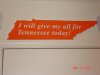
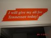
First pic is the sign from Al Hammond. Second sign is from Slap Signs. Both signs are of great solid quality so there's no fear of accidentally dropping one and having it break. The one from Al Hammond has a white edge (not visible in the pic) and kudos to Mr. Hammond for underlining "all'. I'm not a geometry major, but the Al Hammond one appears to be more accurate to what our wonderful state of Tennessee looks like although I don't think the little blip in the top left corner is that prominent. The one from Slap Signs is a little bit thicker and a tad bit larger. Slap Signs decided to do everything in orange minus the lettering and the "all" is not underlined. I don't rate one over the other. They're both worth the money and you can't go wrong with either. Great job to both!