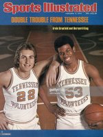
They are not from any specific team. They represent more of a return to a general style that was prevalent from the late 1960's to the early 90's. IIRC, the first Tennessee team to put both "Tennessee" and "Volunteers" on the front of their uniforms was in 1968. The style of the font on the lettering was very much like the style used by the Boston Red Sox on their unis and everything was "tripped" out in blue (see attachment below of King and Grunfeld). Just my opinion, but these were the best looking basketball uniforms that have ever been used by any college basketball team.
This stayed this way up until the arrival of Don Devoe, who changed the font style of the lettering sometime in the mid 1980's to a more block style lettering like you see on these new uniforms. Devoe also put the power "T" on the side of the legs for the first time when he first arrived in 1979. Wade Houston changed our "trip" color from blue to grey, but the "Tennessee Volunteers" on the front remained during his five years at Tennessee. I believe it was under Kevin O'Neal the "Volunteers" was dropped and we started using black as a new "trip" color.
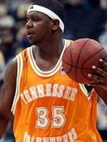
IIRC, there was a period, sometime in the 1990's when we briefly returned to the style of the 1970's uniforms and for about two seasons this was the norm. These uniforms had no "trip" color. They were just orange and white. I recall Ron Slay as being one of the players that wore these uniforms. These were my second favorite Tennessee unis of all time (see image below of Ron Slay).