You are using an out of date browser. It may not display this or other websites correctly.
You should upgrade or use an alternative browser.
You should upgrade or use an alternative browser.
JH show Logo
- Thread starter VetVol
- Start date
I’ve wondered this as well…..almost like a tribute to Oklahoma…..lolView attachment 401530
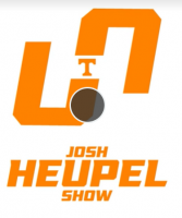
Does anyone understand the Josh Heupel Show logo? Is it supposed to be a white H in the center of the orange? Why does the orange look like a U and an O? Thanks for any insight.
MrWiz
Well-Known Member
- Joined
- May 2, 2020
- Messages
- 97
- Likes
- 246
I had the same question. I see the white H now only because you pointed it out.View attachment 401530
Does anyone understand the Josh Heupel Show logo? Is it supposed to be a white H in the center of the orange? Why does the orange look like a U and an O? Thanks for any insight.
TennesseeTarheel
Sorry, but, this IS my day job.
- Joined
- Oct 2, 2015
- Messages
- 9,615
- Likes
- 15,612
YankeeVol
Let's Geaux Peay
- Joined
- Mar 11, 2010
- Messages
- 146,225
- Likes
- 77,600
VetVol
Man of few posts
- Joined
- Jan 23, 2008
- Messages
- 1,005
- Likes
- 4,639
YankeeVol
Let's Geaux Peay
- Joined
- Mar 11, 2010
- Messages
- 146,225
- Likes
- 77,600
VFL-82-JP
Bleedin' Orange...
- Joined
- Jan 17, 2015
- Messages
- 20,431
- Likes
- 56,055
Okie
Well-Known Member
- Joined
- Sep 11, 2021
- Messages
- 317
- Likes
- 744
VetVol
Man of few posts
- Joined
- Jan 23, 2008
- Messages
- 1,005
- Likes
- 4,639
I think it's the letters Josh Heupel Show artistically intermingled.
J is the left half, in orange.
H is the white cutout.
S is all of the orange together; it's kind of tilted 45 degrees on its side.
But I do wonder about the grey scope sight picture. Not sure what that's meant to signify.
The scope sight was a play symbol from a video of the show (the triangle in the center of the scope circle did not copy). I could not find a still pict of the logo (which I thought was weird).
Volfan1000
Well-Known Member
- Joined
- Aug 3, 2020
- Messages
- 12,113
- Likes
- 18,135
View attachment 401530
Does anyone understand the Josh Heupel Show logo? Is it supposed to be a white H in the center of the orange? Why does the orange look like a U and an O? Thanks for any insight.
That is a very interesting design and eye catching.
- Joined
- Oct 23, 2003
- Messages
- 29,185
- Likes
- 6,148
Samthebam
Well-Known Member
- Joined
- Aug 8, 2010
- Messages
- 340
- Likes
- 1,431
casual-observer
Pantone 151C
- Joined
- Nov 27, 2017
- Messages
- 364
- Likes
- 1,195
OP - im so glad you posted this!
Every week when I watch the show, this has puzzled the crap out if me. I see the ‘H’ now in the white space. The backwards J‘s are a bit strange, too.
I agree, must be some marketing/art major‘s contribution to the show. Maybe someone interning with Casey Funderberg?
Perplexng logo and heavy commerical sponsorship aside, the program is the best in years and CJH presents himself so well. Really shows just how bad we had it with Beltar.
Firebirdparts
Best tackle for his weight the old school ever had
- Joined
- Sep 13, 2014
- Messages
- 4,709
- Likes
- 8,360
chrismc1000
Well-Known Member
- Joined
- Sep 10, 2018
- Messages
- 1,743
- Likes
- 1,298
Harleydude2929
Well-Known Member
- Joined
- Sep 18, 2015
- Messages
- 103
- Likes
- 135
rocytop2624
The 411 Guy.
- Joined
- May 1, 2011
- Messages
- 21,187
- Likes
- 26,108
BruisedOrange
Well... known member
- Joined
- Oct 21, 2013
- Messages
- 8,631
- Likes
- 24,659
One of the surprises in my short, graphic design career was the frustrating, bewildering process of getting logos approved by executive or administrative committees. It was amazing what people would see, foresee, or question about a logo when they were fearful of approving something that years later might be, could be (as all things eventually are) twisted into a negative or a joke. But I never got to be present in those discussions, to respond to their questions or suggestions. I only received a summary, and occasionally an edited minutes from the meeting.
So if y'all don't mind, I've got some long backed up karma in the closet that needs catharsis...
"I'd like the smokey gray circle better if it was black. Any way you could make it larger? And maybe move the T to the center of the circle... or maybe change the circle to the shape of the state of Tennessee! Did you consider that? But otherwise, it looks very nice."
"Since Math and Philosophy are important academic departments at UT, I'm concerned that the logo looks like an incomplete lemniscate, or 'infinity' symbol. Is that really the message we want to send to the viewing public?"
"As the only Asian American on the board, I have to protest the appropriation of the yin and yang symbol, no matter how incompletely it is presented."
"The chair of our Religion Department has consulted the chair of the History Department and both are questioning if the use of orange might be offensive to Catholics, orange being the historic color of Protestantism. Don't we want to be religiously inclusive?
"While the 69 sends an all-inclusive message to our LBGTQ community, the special emphasis of the T might send a paranoic message to our trans community, especially with--as someone pointed out--the gun sight circle. We don't want to create another Sarah Palin's crosshairs ad controversy. Maybe change the circle to a checkmark, or a thumbs up, or something else affirmative. But definitely not a white supremacist OK symbol!"
"Well, actually, I've read that the thumbs up gesture has a negative sexual connotation among the paraplegic community, so... But maybe you could add spoked wheels to the J to make it more inclusive to the mobility challenged."
"You see a 69? I see a 67. Does 67 have any sexual connotations? Now, 1967 was a good year for UT football. We were actually named national champs by one of the minor polls. But that 67 also looks like a mirror image of OU--who beat us in the Orange Bowl that season. Didn't this Heupel fella play for them? Is he subversive? Maybe a trickster? Has he been vetted?"
"I took the liberty to run it by students, and they all agreed it would look better in black, only maybe just leave the Power T orange."
"I thought every great logo had a swoosh in it somewhere. This looks kinda blocky, like something you'd see hung on a chain link fence outside of a construction site. All a bit 'blue collar' for a university, don't you think?"
"I know I speak for everyone when I say we want to congratulate the graphic designer on the work he/she/they has done. I think we're in agreement that this is a good, solid start, and only a few minor changes to the basic design will be needed to gain approval by the committee."
------
Thank you, VolNation, for letting me vent.
And to whoever designed the logo, congratulations on winning its approval. Go Big #FF8200!
So if y'all don't mind, I've got some long backed up karma in the closet that needs catharsis...
I think it's the letters Josh Heupel Show artistically intermingled.
J is the left half, in orange.
H is the white cutout.
S is all of the orange together; it's kind of tilted 45 degrees on its side.
But I do wonder about the grey scope sight picture. Not sure what that's meant to signify.
"I'd like the smokey gray circle better if it was black. Any way you could make it larger? And maybe move the T to the center of the circle... or maybe change the circle to the shape of the state of Tennessee! Did you consider that? But otherwise, it looks very nice."
"Since Math and Philosophy are important academic departments at UT, I'm concerned that the logo looks like an incomplete lemniscate, or 'infinity' symbol. Is that really the message we want to send to the viewing public?"
"As the only Asian American on the board, I have to protest the appropriation of the yin and yang symbol, no matter how incompletely it is presented."
"The chair of our Religion Department has consulted the chair of the History Department and both are questioning if the use of orange might be offensive to Catholics, orange being the historic color of Protestantism. Don't we want to be religiously inclusive?
That looks more like 69 with our T in the middle.
"While the 69 sends an all-inclusive message to our LBGTQ community, the special emphasis of the T might send a paranoic message to our trans community, especially with--as someone pointed out--the gun sight circle. We don't want to create another Sarah Palin's crosshairs ad controversy. Maybe change the circle to a checkmark, or a thumbs up, or something else affirmative. But definitely not a white supremacist OK symbol!"
"Well, actually, I've read that the thumbs up gesture has a negative sexual connotation among the paraplegic community, so... But maybe you could add spoked wheels to the J to make it more inclusive to the mobility challenged."
"You see a 69? I see a 67. Does 67 have any sexual connotations? Now, 1967 was a good year for UT football. We were actually named national champs by one of the minor polls. But that 67 also looks like a mirror image of OU--who beat us in the Orange Bowl that season. Didn't this Heupel fella play for them? Is he subversive? Maybe a trickster? Has he been vetted?"
"I took the liberty to run it by students, and they all agreed it would look better in black, only maybe just leave the Power T orange."
"I thought every great logo had a swoosh in it somewhere. This looks kinda blocky, like something you'd see hung on a chain link fence outside of a construction site. All a bit 'blue collar' for a university, don't you think?"
"I know I speak for everyone when I say we want to congratulate the graphic designer on the work he/she/they has done. I think we're in agreement that this is a good, solid start, and only a few minor changes to the basic design will be needed to gain approval by the committee."
------
Thank you, VolNation, for letting me vent.
And to whoever designed the logo, congratulations on winning its approval. Go Big #FF8200!
Last edited:
sona
Safety...Always Off.
- Joined
- Aug 31, 2016
- Messages
- 4,457
- Likes
- 7,959
stevenrich2003
Well-Known Member
- Joined
- May 5, 2011
- Messages
- 2,905
- Likes
- 5,199


