SEC football helmets ranked

#4
#4
I've never been a fan of Ole Miss's and Florida's scripts on their helmets. The Ole Miss powder blue helmet does look really good though. As the article says I'm really surprised at some point Florida hasn't put the gator logo on their helmet.

Best helmets in the conference from a design perspective is LSU.
 
  • Like
Reactions: RazzBury
#6
#6
Complete horse crap that Georgia's is ranked so high. All that design is is a Green Bay Packers rip off with a different color scheme.

Also, there is absolutely nothing special about Alabama's helmet. It's just because they are so good right now that they get points for these kinds of rankings. That ugly ass maroon with those dull grey facemasks and the boring number on the side? Yeah, that's so next level!

Here's how I would rank the helmets...

1. Tennessee
2. LSU
3. Auburn
4. Mizzou
5. Ole Miss
6. Arkansas
7. Texas A&M
8. Alabama
9. Georgia
10. Kentucky
11. South Carolina
12. Florida
13. Vanderbilt
14. Mississippi State
 
#8
#8
This is garbage, the most classic helmets in the SEC are ours, LSU's, Auburn's, Bama's and Georgia's in that order.
 
#10
#10
I favor classic, simple designs for helmets. USC, Mizz, are the worst because they are too busy. Miss state is not as bad but in that category, too. There is too much detail on the designs which simply looks like a hot mess even from a moderate distance.
Until this ranking, I was unaware how many SEC schools use a cursive font on the helmet...so I don't like those because they are unoriginal. However, the Florida "F" helmets are even worse than the script design.
TAMU and Bama need different helmets because one looks like they play for money dispensing machines and the other it too plain. Bama's signature "A" is too easily confused for the Atlanta Braves and they miss the opportunity to reinforce there "brand" on their domes.
I like LSU's the best.
 
  • Like
Reactions: VFL-82-JP
#11
#11
Few more thoughts:

- Vandy's is way too low. That simple star logo with the V that they came up with a few years ago is a really clean look.
- I like Texas A&M's helmet logo but have never liked their colors, or Miss St's for that matter. Maroon just isn't a good looking color.
- Arky's razorback logo is underrated, as is South Carolina's gamecock inside of the C.
- Scripts: for some reason I like South Carolina's script logo, but not a huge fan of Florida's or Ole Miss's. Florida should ditch their script in favor of the gator logo or the F.
- The shade/shine of Bama's crimson is very bland. Looks OK on the jersey, not good at all on the helmet. And yes, the only reason it has a "classic" look to it is because they're good.
- I like Georgia's colors, but the G is simply a Green Bay Packers ripoff as others have noted.
- Ole Miss's power blue helmet should be their primary helmet, but never been a fan of the script.
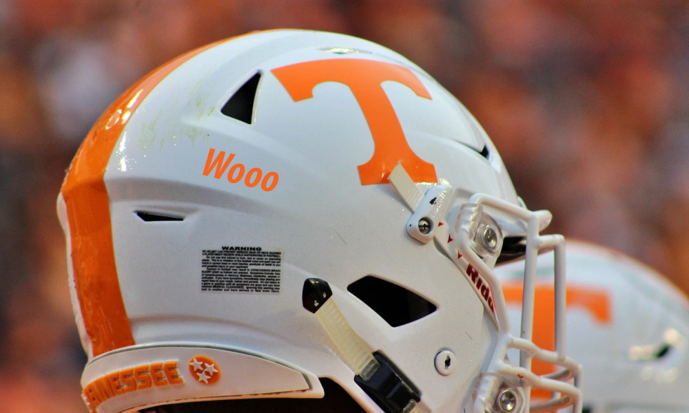
- Auburn and Tennessee: both simple, clean logos. I'll totally admit that Tennessee orange is a love it or hate it kind of thing though.
- Mizzou's tiger logo looks like a high school team. Generic looking.
- Best helmet overall is LSU. Good color, and I like the LSU script being high on the helmet and curved.
 
#16
#16
TAMU and Bama need different helmets because one looks like they play for money dispensing machines and the other it too plain. Bama's signature "A" is too easily confused for the Atlanta Braves and they miss the opportunity to reinforce there "brand" on their domes.

Are you saying that Bama should put the script 'A' on the helmet because it's easily confused with the Braves?
 
#19
#19
So according to that guy...

Ole Miss script = best in the SEC
SCarolina’s script Carolina lids = great alternative to the block C lids
UF’s Gator script = boring

Yay consistency.
 
  • Like
Reactions: BUBear
#21
#21
Hard to beat the power T.
4ltvwuF.jpg
 

VN Store


Back
Top