New wordmark...

#1

GiveEmSix

Well-Known Member
Joined
Aug 18, 2010
Messages
407
Likes
356
#1
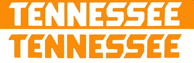
What do you think about it? AND Why no "slant effect" on the 2nd N in Tennessee?

Is this any indication of the new upcoming font for numbers DeerPark?

Photos: Soon to be Nike school, Tennessee has a new wordmark

CGl-pKcUgAAQ9Zp.jpg:small
 
Last edited:
  • Like
Reactions: 2 people
#7
#7
If they don't straighten the T and even out the E I'm not going to cheer for the team this year.
 
  • Like
Reactions: 17 people
#8
#8
I can live with it. Understand the pattern with the second n and e. Now if the State will hire Nike to redo that gawd awful new state emblem.
 
  • Like
Reactions: 7 people
#10
#10
I think it's slanted like that because it's suppose to represent the shape of the state. I actually kinda like it.
 
  • Like
Reactions: 6 people
#11
#11
Well, the top of the T and other letters resemble the state so that's pretty cool. As for the second N, just a guess but it seems to be the only letter that isn't next to a letter with a slanted horizontal element to it so there is nothing to slant against.
 
  • Like
Reactions: 5 people
#13
#13
As long as it's not across the football jersey like the jersey last year then I'm fine. Was hoping that the power T would be at the center of the basketball court.
 
  • Like
Reactions: 2 people
#19
#19
I for one love it. Shape of the state visible in the tops of several of the letters = awesome, and unique look = (after a bit of getting used to it) trendy. I'm a fan. :eek:k:
 
#21
#21
I'm going to wait and see the final version. You guys are critiquing a mock of what somebody thinks it will look like, based on 3 visible letters. C'mon.
 
#22
#22
It's growing on me as well.

One thing to keep in mind, that is a low res image. The lines on the letters are not sharp at all. It will look even better once they release higher quality images.
 

VN Store


Back
Top