"P" Patch

#1

SoDak_LV_Fan

Well-Known Member
Joined
Dec 7, 2015
Messages
65
Likes
78
#1
While watching the men play last night (not very well), I noticed they do not wear a P patch on their jersey in memory of Pat.
Has anyone else noticed this or is there a reason why? I think all other sports did so far this season. Doesn't sit too well with me considering how terrible the men's team have traditionally been and we all know Pat's legacy with the university.
 
  • Like
Reactions: 1 person
#2
#2
Let's tell the men to wear the P patch--but in exchange the women's program must modernize its awful, antiquated "Lady Vols" logo, which is 20 years out of date. To say that the soft shade of blue along with the feminine, swirly, cursive type doesn't work anymore would be an understatement. It was fine for a long time, but it's weak looking now--not a logo that contributes to the image of power program or the modern female athlete. It does, sadly, connote the stumbling program, clinging to its PS past, that we've been for several years.
 
  • Like
Reactions: 9 people
#3
#3
Let's tell the men to wear the P patch--but in exchange the women's program must modernize its awful, antiquated "Lady Vols" logo, which is 20 years out of date. To say that the soft shade of blue along with the feminine, swirly, cursive type doesn't work anymore would be an understatement. It was fine for a long time, but it's weak looking now--not a logo that contributes to the image of power program or the modern female athlete. It does, sadly, connote the stumbling program, clinging to its PS past, that we've been for several years.

Your opinion
 
  • Like
Reactions: 15 people
#4
#4
Let's tell the men to wear the P patch--but in exchange the women's program must modernize its awful, antiquated "Lady Vols" logo, which is 20 years out of date. To say that the soft shade of blue along with the feminine, swirly, cursive type doesn't work anymore would be an understatement. It was fine for a long time, but it's weak looking now--not a logo that contributes to the image of power program or the modern female athlete. It does, sadly, connote the stumbling program, clinging to its PS past, that we've been for several years.

Wow! What an azz.
 
  • Like
Reactions: 10 people
#5
#5
Let's tell the men to wear the P patch--but in exchange the women's program must modernize its awful, antiquated "Lady Vols" logo, which is 20 years out of date. To say that the soft shade of blue along with the feminine, swirly, cursive type doesn't work anymore would be an understatement. It was fine for a long time, but it's weak looking now--not a logo that contributes to the image of power program or the modern female athlete. It does, sadly, connote the stumbling program, clinging to its PS past, that we've been for several years.

You are right. Good post.
 
  • Like
Reactions: 6 people
#7
#7
I think the logo would look better with the lady volunteers in front of a "Power T" instead of the Block T.
 
  • Like
Reactions: 1 person
#9
#9
Let's tell the men to wear the P patch--but in exchange the women's program must modernize its awful, antiquated "Lady Vols" logo, which is 20 years out of date. To say that the soft shade of blue along with the feminine, swirly, cursive type doesn't work anymore would be an understatement. It was fine for a long time, but it's weak looking now--not a logo that contributes to the image of power program or the modern female athlete. It does, sadly, connote the stumbling program, clinging to its PS past, that we've been for several years.

Lady Vol's for ever, go support Uconn, they don't like ladies.
 
  • Like
Reactions: 5 people
#10
#10
If the they do in the future do away with the Lady Vol logo in the future, I hope they decide to keep the baby blue accent color. That blue orange and white color way is pretty dope.
 
  • Like
Reactions: 1 person
#12
#12
Let's tell the men to wear the P patch--but in exchange the women's program must modernize its awful, antiquated "Lady Vols" logo, which is 20 years out of date. To say that the soft shade of blue along with the feminine, swirly, cursive type doesn't work anymore would be an understatement. It was fine for a long time, but it's weak looking now--not a logo that contributes to the image of power program or the modern female athlete. It does, sadly, connote the stumbling program, clinging to its PS past, that we've been for several years.
:no::bad:
 
  • Like
Reactions: 2 people
#14
#14
If the they do in the future do away with the Lady Vol logo in the future, I hope they decide to keep the baby blue accent color. That blue orange and white color way is pretty dope.

Mamba,this sounds as if you either just awakened or have had an early toddy or two. Clarify for us!
 
#15
#15
While watching the men play last night (not very well), I noticed they do not wear a P patch on their jersey in memory of Pat.
Has anyone else noticed this or is there a reason why? I think all other sports did so far this season. Doesn't sit too well with me considering how terrible the men's team have traditionally been and we all know Pat's legacy with the university.

The Lady Vol basketball team is the only team on campus to have worn a patch this season. Football wore a helmet sticker. The other teams have not elected to do anything, which I don't have a problem with.
 
  • Like
Reactions: 2 people
#16
#16
Mamba,this sounds as if you either just awakened or have had an early toddy or two. Clarify for us!

I mean if they ever stop with the whole Lady Volunteers logo and go to using the Power T that they could create like an alternate uniform for the women's basketball team. The women would still be wearing the T, but they would create like a throwback uni where they could incorporate just the powder blue into the uniforms, it would be like a homage to Pat and the former Lady Vols. Do you get what I'm trying to say now?
 
#18
#18
If the they do in the future do away with the Lady Vol logo in the future, I hope they decide to keep the baby blue accent color. That blue orange and white color way is pretty dope.

+1 The baby blue accent is EVERYTHING to me! It goes great with the orange!
 
  • Like
Reactions: 4 people
#19
#19
The logo is old, and looks it. I know it means something to a lot of fans, including me, but it's not a strong looking logo. The block T is weak; powder blue, weak; the type, weak. If you asked 10 graphic designers for their opinion of it, 9 would cringe.
 
#20
#20
The power T is "old" and if you review logos of sports teams many are old. And then fans of football teams get excited if throwback uniforms are returned, or used in a bowl; contests on which way and how wide the stripe on the helment. The NFL finds players who use green colored cleats.

The issue is very clear - males who follow UT football would like to dictate or mandate conformity from women teams, as does the seller of athletic goods. And it just happens the team they want to conform is the most successful athletic team and the only reason they are pushing it is the most famous coach in UT history recently died.
 
  • Like
Reactions: 10 people
#21
#21
I think the logo would look better with the lady volunteers in front of a "Power T" instead of the Block T.

For now, I think the logo will look a lot better if the LV's continue to play and improve the way they have done since the Baylor azz kicking.
 
  • Like
Reactions: 2 people
#22
#22
The power T is "old" and if you review logos of sports teams many are old. And then fans of football teams get excited if throwback uniforms are returned, or used in a bowl; contests on which way and how wide the stripe on the helment. The NFL finds players who use green colored cleats.

The issue is very clear - males who follow UT football would like to dictate or mandate conformity from women teams, as does the seller of athletic goods. And it just happens the team they want to conform is the most successful athletic team and the only reason they are pushing it is the most famous coach in UT history recently died.

Nailed it.
 
  • Like
Reactions: 1 person
#23
#23
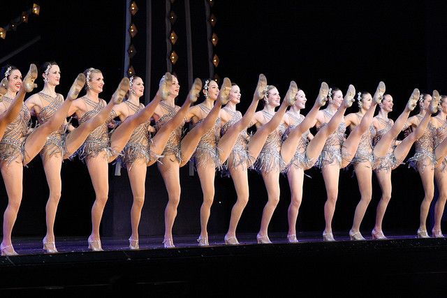
In Pat's Sum It Up this was mentioned...The women’s teams in all sports were called Vollettes until that time, but coach Summitt wrote that she called a team meeting to change the name. This was in part because she thought Vollettes sounded like a chorus line of dancing girls.
21813459e33a092d8df07dbd642c39b0.jpg
 
#24
#24
Let's tell the men to wear the P patch--but in exchange the women's program must modernize its awful, antiquated "Lady Vols" logo, which is 20 years out of date. To say that the soft shade of blue along with the feminine, swirly, cursive type doesn't work anymore would be an understatement. It was fine for a long time, but it's weak looking now--not a logo that contributes to the image of power program or the modern female athlete. It does, sadly, connote the stumbling program, clinging to its PS past, that we've been for several years.

No. Lets embrace tradition rather than diss it.
 
  • Like
Reactions: 6 people
#25
#25
The power T is "old" and if you review logos of sports teams many are old. And then fans of football teams get excited if throwback uniforms are returned, or used in a bowl; contests on which way and how wide the stripe on the helment. The NFL finds players who use green colored cleats.

The issue is very clear - males who follow UT football would like to dictate or mandate conformity from women teams, as does the seller of athletic goods. And it just happens the team they want to conform is the most successful athletic team and the only reason they are pushing it is the most famous coach in UT history recently died.


for a couple of reasons.

First, logos get dated and look old--some more so than others, depending on the design. Companies and athletic departments often change and/or modernize their logos--my daughter's school modernized their logo two years ago. The new logo is much better looking. The fact that a school has kept the same logo for a long time certainly doesn't mean it's a good logo--it means only that it hasn't been changed. The Power T logo is old--but it has been tweaked over the years. More to the point, it has worked over time because it is very simple in design AND because it is a strong-looking T. That is WHY it is called the Power T. There is nothing strong about the Lady Vols logo--it evokes women wearing aprons.

Check out the T on our football helmets in the 1970s. They are thin and not very strong looking. It wasn't a "power" T. What happened? The design was changed--the T made wider, for one thing--and at some point became the Power T we know today. Because it is so simple--a T--it doesn't need to be changed a lot, and yet still is from time to time. The Lady Vol logo is not simple, and it very clearly looks old. It is time to retire it in the same way that Summitt realized that the name Volettes was lame.

Second, the idea that the men just want to impose their will on a women's program is nonsense. You want uniformity in an athletic department--it is efficient; it is common sense. Having separate athletic departments doesn't make financial or common sense, and neither does have multiple team logos.

When the UT women's basketball program started, there were virtually no other women's sports. There was no Title IX or equality in sports. Now that there is equality--and anyone who's not a complete neanderthal should be very thankful for Title IX, the diehards want to stay separate. It is silly. Times change.

Find me other university sports programs that have a logo and ID separate from all the others sports program at the school. Are there ANY? Do the UConn women have their own logo? Does the UNC women's soccer program--20 national titles? No, they don't. Schools have a single sports logo--twas ever so.

You can't cling to the Summitt era--and yet many do, out of nostalgia. That's why we still have Warlick as our coach, and why we have a logo that reflects our style of play--dated. Those who cling to the past merely impede progress.
 

VN Store


Back
Top