Out with the new, in with tradition!!

#76
#76
We are pretty much going back to the traditional uniforms we used to wear when Fulmer was here....See the connection yet?...Starting to wonder who the actual head coach is over there...Oh well I love the old uniforms, Hated the greys with a passion.

Think Pruitt isn’t old style? Doubt Fulmer runs any practices in the near future. You’re hoggin all the tin foil! :shades:
 
  • Like
Reactions: 3 people
#77
#77
We are pretty much going back to the traditional uniforms we used to wear when Fulmer was here....See the connection yet?...Starting to wonder who the actual head coach is over there...Oh well I love the old uniforms, Hated the greys with a passion.

I think you're right that this is a Fulmer move. Do you think the AD or the head coach should be worried about uniforms?

I think Butch convinced some of you that a HC is supposed to be worried about the brand of trash bags used in the men's room. I think our first year coach should start with the bigger items like whether we are going to field an offensive line this year, and work his way down.
 
#78
#78
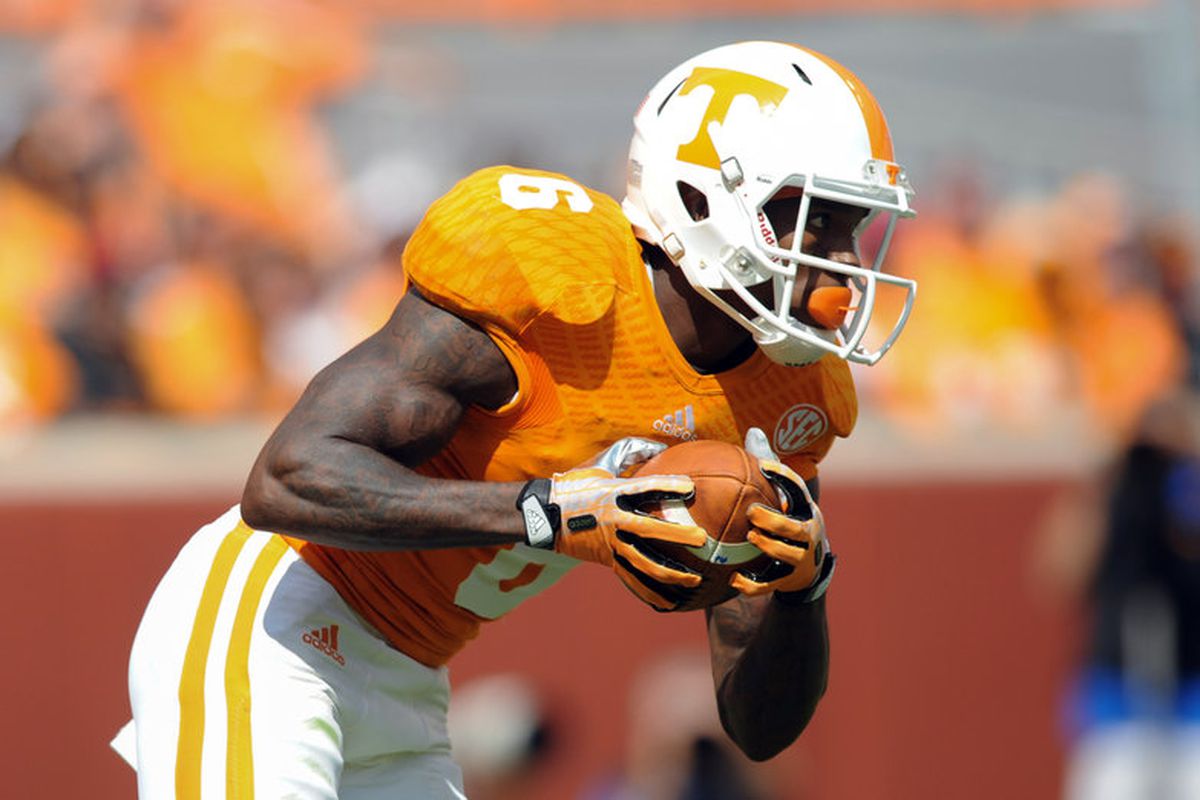
Could have brought back these that didn't even last a full season

WittenJason2.jpg

I love the last generation / version of Adidas that debuted in 2013 but that 2002 update was the absolute worst. Maybe even worse than the checkerboard stripes Nike pulled out of their tails.
 
#79
#79
I'm pretty sure he's referring to the undershirts we used to wear under Adidas

tennessee_football.jpg

Still prefer this jersey much more the Nike version. Love the little subtle curves on the numbers that match the curves/font of the power T. The small, subtle outline of the state on the back of the neck of the home jersey was slick. Also the checkerboard pattern inside the orange numbers on the road and gray jerseys was a much more creative, classy, and subtle way to integrate checkerboard into the jersey as opposed to that ridiculousness that Nike pulled out of their tails.

The checkerboard pattern wasn't noticeable unless you were up close to the Adidas version. It was also done with direction of the threading. To me, THAT is slick... I also actually didn't mind the "TENNESSEE" script above the numbers because it was away only...

And don't get me started on how much more I liked the Adidas version of the gray jersey. They "started" it and got it right, in my opinion. I love the white outline of the numbers and how it carried over to the stripes on the pants. Also, imagine if Adidas had been allowed to introduce gray helmets like Nike was allowed to do. The gray background with an orange T and stripe, outlined in white. Now that would "pop". The main reason some hold the Nike version in such high regard is the helmet anyway. Simply, Adidas could've knocked it out of the park with a matching helmet and not being stuck with the usual white...
 

Attachments

  • 9138664.jpg
    9138664.jpg
    24 KB · Views: 4
Last edited:
#80
#80
Still prefer this jersey much more the Nike version. Love the little subtle curves on the numbers that match the curves/font of the power T. The small, subtle outline of the state on the back of the neck of the home jersey was slick. Also the checkerboard pattern inside the orange numbers on the road and gray jerseys was a much more creative, classy, and subtle way to integrate checkerboard into the jersey as opposed to that ridiculousness that Nike pulled out of their tails.

The checkerboard pattern wasn't noticeable unless you were up close to the Adidas version. It was also done with direction of the threading. To me, THAT is slick... I also actually didn't mind the "TENNESSEE" script above the numbers because it was away only...

And don't get me started on how much more I liked the Adidas version of the gray jersey. They "started" it and got it right, in my opinion. I love the white outline of the numbers and how it carried over to the stripes on the pants. Also, imagine if Adidas had been allowed to introduce gray helmets like Nike was allowed to do. The gray background with an orange T and stripe, outlined in white. Now that would "pop". The main reason some hold the Nike version in such high regard is the helmet anyway. Simply, Adidas could've knocked it out of the park with a matching helmet and not being stuck with the usual white...

There are individual pieces of the Adidas uniforms that were cool but all of them where inferior as a whole imo. That Tennesee across the chest looks MAC-ish, the grays looked mostly awful, the tire tread pattern was garb, the material looked cheap when put side by side with Nike's versions, etc. I did like the low key checkerboard pattern in the numbers, the actual font, and white outlines on the grays. Overall though, we upgraded significantly with Nike. Jmo.
 
  • Like
Reactions: 1 person
#81
#81
There are individual pieces of the Adidas uniforms that were cool but all of them where inferior as a whole imo. That Tennesee across the chest looks MAC-ish, the grays looked mostly awful, the tire tread pattern was garb, the material looked cheap when put side by side with Nike's versions, etc. I did like the low key checkerboard pattern in the numbers, the actual font, and white outlines on the grays. Overall though, we upgraded significantly with Nike. Jmo.

I'm an Adidas guy when it comes to apparel. I didn't like going to Nike at the time either. But even I have to admit the Nike uniforms look better. Adidas never could match the orange correctly throughout the uniform. I know different lighting is a B, but Nike doesn't seem to have an issue with it.
 
#82
#82
I'm an Adidas guy when it comes to apparel. I didn't like going to Nike at the time either. But even I have to admit the Nike uniforms look better. Adidas never could match the orange correctly throughout the uniform. I know different lighting is a B, but Nike doesn't seem to have an issue with it.

Yeah, they couldn't even get the jersey color right much less match it with the pants and equipment lol.

Its all personal choice and I get that...I just can't understand it lol. As far as branded, team apparel its no contest between Nike and Adidas as to who sells more styles of shirts, jackets, hoodies, etc. My absolute biggest gripe with Adidas is you could never find anything in their Climalite while somewhere near 50% of Nike fan gear is Dri-fit polyester. Subjectively, I just like their designs better as well but to each their own.
 
  • Like
Reactions: 1 person
#83
#83
Yeah, they couldn't even get the jersey color right much less match it with the pants and equipment lol.

Its all personal choice and I get that...I just can't understand it lol. As far as branded, team apparel its no contest between Nike and Adidas as to who sells more styles of shirts, jackets, hoodies, etc. My absolute biggest gripe with Adidas is you could never find anything in their Climalite while somewhere near 50% of Nike fan gear is Dri-fit polyester. Subjectively, I just like their designs better as well but to each their own.

I wish our guys had more access to accessories, mini arm bands, half sleeves with the power T on it etc.
 
#84
#84
Yeah, they couldn't even get the jersey color right much less match it with the pants and equipment lol.

Its all personal choice and I get that...I just can't understand it lol. As far as branded, team apparel its no contest between Nike and Adidas as to who sells more styles of shirts, jackets, hoodies, etc. My absolute biggest gripe with Adidas is you could never find anything in their Climalite while somewhere near 50% of Nike fan gear is Dri-fit polyester. Subjectively, I just like their designs better as well but to each their own.

It's a fit issue with Nike for me. They just don't cut clothes for my body type. In cold weather I found Adidas apparel to be warmer and softer. It takes all kinds I guess. I don't buy shoes from either.
 
  • Like
Reactions: 3 people
#85
#85
It's a fit issue with Nike for me. They just don't cut clothes for my body type. In cold weather I found Adidas apparel to be warmer and softer. It takes all kinds I guess. I don't buy shoes from either.

That is fair on fit. Nike caters to a less...robust body type lol. If you are shaped like a rectangle like I am, you are out of luck a lot of the time on Nike stuff unless you buy a size up. Especially with "athletic cut" shirts. Nike athletic shoes are mostly trash tier tbh, especially the bulk of their running shoes.
 
  • Like
Reactions: 2 people
#86
#86
That is fair on fit. Nike caters to a less...robust body type lol. If you are shaped like a rectangle like I am, you are out of luck a lot of the time on Nike stuff unless you buy a size up. Especially with "athletic cut" shirts. Nike athletic shoes are mostly trash tier tbh, especially the bulk of their running shoes.


Yeah, either it fits in the shoulders and is too short, or it is long enough, but entirely to wide. I can't speak to the running shoes. There so dang narrow I haven't been able to get my foot in one that wasn't special ordered since I was about 14. Their clothes don't seem to be built for good Celtic stock.
 
  • Like
Reactions: 1 person
#87
#87
Still prefer this jersey much more the Nike version. Love the little subtle curves on the numbers that match the curves/font of the power T. The small, subtle outline of the state on the back of the neck of the home jersey was slick. Also the checkerboard pattern inside the orange numbers on the road and gray jerseys was a much more creative, classy, and subtle way to integrate checkerboard into the jersey as opposed to that ridiculousness that Nike pulled out of their tails.

The checkerboard pattern wasn't noticeable unless you were up close to the Adidas version. It was also done with direction of the threading. To me, THAT is slick... I also actually didn't mind the "TENNESSEE" script above the numbers because it was away only...

And don't get me started on how much more I liked the Adidas version of the gray jersey. They "started" it and got it right, in my opinion. I love the white outline of the numbers and how it carried over to the stripes on the pants. Also, imagine if Adidas had been allowed to introduce gray helmets like Nike was allowed to do. The gray background with an orange T and stripe, outlined in white. Now that would "pop". The main reason some hold the Nike version in such high regard is the helmet anyway. Simply, Adidas could've knocked it out of the park with a matching helmet and not being stuck with the usual white...
I hated those. Other college fans know we are Tennessee why do we have to print it on our jerseys? Stupid!
 
#89
#89
I hated those. Other college fans know we are Tennessee why do we have to print it on our jerseys? Stupid!

I get what you're attempting to say, but practically 100% of basketball, baseball, softball, along with practicality all other sports jerseys, go against this statement.
 
#90
#90
I'm an Adidas guy when it comes to apparel. I didn't like going to Nike at the time either. But even I have to admit the Nike uniforms look better. Adidas never could match the orange correctly throughout the uniform. I know different lighting is a B, but Nike doesn't seem to have an issue with it.
"Never"? The two pictures I posted above say differently... Agreed that it was a struggle in the early years with Adidas, and practically all generations prior, but I doubt that matching the helmet decals with the jerseys was 100% all on the apparel company 15-20 years ago like it is now. The helmet suppliers had a hand in that matching issue too. Now, the apparel companies appear to take the lead with developing the helmet design...

The last two to three years with Adidas the helmets and jerseys were practically perfect as far as matching goes. Just simply look at the two pictures I posted in my previous post above.
 
Last edited:
#91
#91
Sorry. One of the things Jones did that I liked a lot was the Smokey Grey uniforms. I love that helmet.
 
  • Like
Reactions: oz615
#92
#92
"Never"? The two pictures I posted above say differently... Agreed that it was a struggle in the early years with Adidas, and practically all generations prior, but I doubt that matching the helmet decals with the jerseys was 100% all on the apparel company 15-20 years ago like it is now. The helmet suppliers had a hand in that matching issue too. Now, the apparel companies appear to take the lead with developing the helmet design...

The last two to three years with Adidas the helmets and jerseys were practically perfect as far as matching goes. Just simply look at the two pictures I posted in my previous post above.

Here is an example.

20130928_jla_bs1_341.0_standard_783.0.0.jpg
 
#93
#93
Define tradition ... tradition to some of you is what UT looked like when you were there or what UT looked like in 1999. It is 2018. Use of gray in the uniforms was not new, just a new design with the color.

What next .. remove the checkerboards from the end zone, move back to turf, move the T back to the middle verses the end zones, put a stop to the VFL program, do away with checker Neyland, etc.

This has Fulmer written all over it - IMO the old man seems to be trying to relive his glory days. Hopefully at some point he will realize times have changed and the student and fan of 2018 is very different than student and fan of 1999. And he needs the new generation to fill that stadium.
 
  • Like
Reactions: 2 people
#94
#94
Define tradition ... tradition to some of you is what UT looked like when you were there or what UT looked like in 1999. It is 2018. Use of gray in the uniforms was not new, just a new design with the color.

What next .. remove the checkerboards from the end zone, move back to turf, move the T back to the middle verses the end zones, put a stop to the VFL program, do away with checker Neyland, etc.

This has Fulmer written all over it - IMO the old man seems to be trying to relive his glory days. Hopefully at some point he will realize times have changed and the student and fan of 2018 is very different than student and fan of 1999. And he needs the new generation to fill that stadium.

I've seen people advocate both going back to turf and stopping the checker Neyland thing. Some people are terrified of change. In fairness the issues we had with the field a few years ago make an argument for turf. I've not seen anyone make the tradition argument for it though.

For my part I liked the grays, but am ready for a new alt. They have bad memories attached to them and I think it's time to move on. To me the black cleats are the most absurd thing we're doing. But that's just my opinion.
 
#95
#95
I've seen people advocate both going back to turf and stopping the checker Neyland thing. Some people are terrified of change. In fairness the issues we had with the field a few years ago make an argument for turf. I've not seen anyone make the tradition argument for it though.

For my part I liked the grays, but am ready for a new alt. They have bad memories attached to them and I think it's time to move on. To me the black cleats are the most absurd thing we're doing. But that's just my opinion.
Black cleats have always looked awful with no black in the uniforms...but whatever.
 
#96
#96
Black cleats have always looked awful with no black in the uniforms...but whatever.

It looks 2nd rate in 2018. But your right, it's a small thing. It's the perfect microcosm for the irrational desire to avoid all change even if it's an improvement though.
 
#97
#97
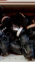
Found this picture posted today of the new black cleats. Sorry posting here, the most recent uniform thread I could find.
 

Attachments

  • D1C120DF-CA04-4D7E-A2CD-7055144E248B.png
    D1C120DF-CA04-4D7E-A2CD-7055144E248B.png
    3.2 MB · Views: 17
  • Like
Reactions: oz615
#98
#98


Okay look at the Black Cleats, I honestly don't care about the color (even though I like them).

Look at the spikes. Those cleats are made for better grip on the turf (less slipping) they are designed to press in to the turf and not rip it up. Looks like we are getting smarter on the equipment front.
 
  • Like
Reactions: oz615
#99
#99
B0C10A21-1466-416A-8E4C-D883F1ECE2FC.gif
We are analyzing cleats? Please dear Lord Baby Jesus, 9lb 7 oz baby jesus let the season start?!
 

VN Store


Back
Top